
← Volver al baúl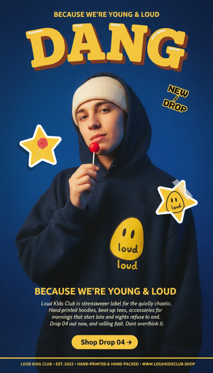
BrandingNano Banana 2Vertical 9:16Oficial
Landing streetwear Y2K — LOUD KIDS CLUB
Póster-landing vertical 9:16 estilo Y2K skate-streetwear. Ajusta marca, eslogan, copy y la paleta entera a tu gusto.
// tu_prompt
Vertical mobile-first landing page for a fictional streetwear brand called "LOUD KIDS CLUB" (placeholder). Full-page poster-as-landing-page aesthetic in the spirit of Y2K skate-surf streetwear culture. Bold chunky slab-serif wordmark, character-driven photography, sticker-style brand glyphs, vivid color gradient. Irreverent, playful, confident energy. Canvas: Vertical 9:16 mobile composition. Full-bleed background: a rich deep royal-blue to muted navy vertical gradient (#2e5bac at the top fading into #1a2d4f at the bottom) with subtle film grain and slight vignette at the edges. Top banner (across the very top of the page): Small tracked uppercase sans-serif intro line in bright marigold-yellow: "BECAUSE WE'RE YOUNG & LOUD" Directly below: a massive bold chunky slab-serif wordmark in vivid marigold-yellow (#f4c542), with a thick 3D shadow / bevel effect in darker yellow-orange. The wordmark looks like it belongs on a '90s cereal box or arcade cabinet. Reads: "DANG" (or alternative: "DANG", "YIKES", "WOW", "OOPS" — short punchy exclamation) Letters are tightly tracked, slightly tilted with playful misalignment, some letters hand-drawn with imperfect terminals. Each letter has a small chrome-highlight reflection on top. Central hero photograph (dominant, fills ~60% of vertical space): A cinematic portrait of a young person seen from chest-up, gazing slightly upward with a casual cool expression. They wear: A cream / off-white knit beanie pulled down over forehead. An oversized dark navy hoodie with the hood up, casting a soft shadow on their face. In the center of the hoodie chest: a generic cartoon character glyph — a bright yellow oval/egg-shaped smiley face with two simple black dot eyes and a small curved mouth, drawn in a rough hand-scrawled style (NOT resembling Drew House, Smiley Company, or any existing brand — it's an original friendly blob character). Below the face, in playful hand-drawn rounded lowercase letters inside the yellow shape, the text reads: "loud". The model holds a small round red lollipop on a white stick at mouth-level, playful gesture — like they're about to take a lick, head tilted slightly, with a confident youthful smirk. Slight motion blur in one hand suggesting playful energy. Studio lighting: soft blue rim-light matching the background tone, warm natural skin tones, shot with slight film grain for authentic Y2K-inspired feel. Sticker-style graphic overlays (scattered across the composition, DIY collage feel): Three bright yellow star-shaped stickers floating over the photograph at playful angles, as if stuck onto the page like real peel-off vinyl stickers: Left sticker (middle-left area): A yellow star containing a small photo clipping of the same lollipop close-up (reusing the product detail), slight tilt left. Feels like a cut-out magazine collage element. Right sticker (middle-right area): A yellow star with the same friendly blob character face inside (two dot eyes, small mouth, lowercase text reading "loud" on the cheek), tilted right. Visible tape-corner suggesting it's stuck on. Optional small third sticker (upper-right or lower-left): A yellow star with pixelated "NEW / DROP" text inside in bold sans-serif, small size, rotated playfully. Each sticker has a subtle white outer border (simulating a real vinyl sticker edge) and soft cast shadow beneath giving it depth. Bottom content block (below the hero photo): Centered headline: In medium-bold condensed uppercase sans-serif, bright marigold-yellow: "BECAUSE WE'RE YOUNG & LOUD" Below, a short 4-line body copy in small italic serif, cream-white (generic placeholder copy in English): "Loud Kids Club is a streetwear label for the quietly chaotic. / Hand-printed hoodies, beat-up tees, accessories for / mornings that start late and nights that refuse to end. / Drop 04 out now, and selling fast. Don't overthink it." CTA pill button (below body copy, centered, bright yellow fill with charcoal text): "Shop Drop 04 →" Bottom strip (very thin, full-width, tracked uppercase sans-serif in muted yellow-cream): "LOUD KIDS CLUB · EST. 2022 · HAND-PRINTED & HAND-PACKED · WWW.LOUDKIDSCLUB.SHOP" Palette: royal-blue to deep navy gradient background (#2e5bac to #1a2d4f), vivid marigold yellow (#f4c542), deep yellow-orange shadow (#c98a1e), cream-white typography for body copy (#f5efe3), charcoal-black for glyph linework (#1a1a1a), punchy red lollipop (#d44a3a), natural skin tones. Typography: massive chunky slab-serif for wordmark (like Bungee Slab, Bungee Inline, or Hardcore Slab), bold condensed uppercase sans for labels, italic serif for body copy (Tiempos Text / Garamond Italic / DM Serif Text Italic), hand-drawn playful lettering for sticker brand-glyph. Mood: playful, irreverent, Gen-Z youth-coded, Y2K skate-surf-streetwear, sticker-collage DIY, confident and fun. Finish: subtle film grain, slight CRT-warmth, sticker drop-shadows, vintage screen-print feel. Awwwards / Behance-quality streetwear brand landing page, 4k vertical.
Editar el prompt no cambia la imagen — es el ejemplo de referencia. Copia el prompt y pégalo en tu IA favorita.